Beauty shoppers often make a fast first judgment from a small product image. That makes consistency more than a design preference. It helps customers recognize a range, compare options, and understand what they are buying before they read every product detail. Strong beauty product photography creates a reliable visual system that can carry from a product page to a marketplace listing, email campaign, and social post.
The goal is not to make every image identical. A moisturizer jar, lip color, serum bottle, and cleansing balm may need different lighting and compositions. The goal is to make each asset feel like it belongs to the same brand while representing the item honestly and clearly.
Why Visual Consistency Matters
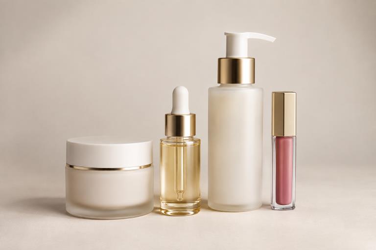
A catalog with shifting backgrounds, uneven crops, or unrelated lighting can make comparison harder. In contrast, a shared visual approach lets a shopper scan a collection and quickly distinguish products, sizes, shades, and formulas. For example, a skincare range may include a tall pump bottle, a short glass jar, and a dropper serum. They should not be forced into the same composition, but they can share a background treatment, color grade, product scale, and overall lighting character.
Consistency also leaves room for variety. Clean catalog images can provide clarity, while lifestyle scenes can explain routine, texture, or mood. Each image should have a job rather than simply repeating the same product view.
Set Clear Visual Rules Before Production
Start with a concise image style guide. It gives photographers, designers, retouchers, and ecommerce teams a common reference before files begin to multiply. A useful guide supports the kind of helpful, reliable information customers need when they are evaluating a product online.
Recommended Rules To Define
- Approved background colors, surfaces, and prop limits.
- Primary camera angle, product position, and crop ratio.
- Safe space for copy, badges, or retailer-required overlays.
- Shadow direction, softness, color temperature, and contrast.
- When to use a clean catalog image, texture close-up, or lifestyle frame.
- How much of the label must remain visible in each image type?
Plan A Complete Image Set For Each Product
One attractive hero image rarely answers every question a shopper has. Plan a small set of images with distinct purposes, then use that plan across the range. The exact number can vary by product, but the core roles remain useful.
- Primary product view: Presents the item clearly at a useful size.
- Secondary angle: Shows shape, depth, closure, or applicator details.
- Packaging detail: Makes important front, side, or back-panel information easier to inspect.
- Texture or finish view: Shows cream, powder, gloss, shimmer, or liquid realistically.
- Scale reference: Helps communicate the product’s physical size.
- Use-case image: Places the product in a believable routine or setting.
- Shade or variant view: Clarifies differences in color, scent, size, or formula.
Control Color, Texture, And Packaging Detail
Beauty products demand close attention because color, fine print, reflective materials, and finish can shift during capture and editing. Compare files against an approved physical sample or approved brand reference, not only against a monitor. Check glossy caps, foil, glass, and clear packaging for highlights that hide useful features. Texture should look tactile, but not so exaggerated that it misrepresents the formula.
When visible claims or label language appear in an image, they should match the approved packaging and marketing review. The FDA explains that cosmetic labeling claims can affect how a product is regulated, so creative teams should not casually add, alter, or visually imply product benefits.
Adapt Images To Each Sales Channel
Use a consistent master image system, then prepare channel-specific versions. An online store may support multiple product views and zooming. A marketplace may impose requirements for the primary image. Social content often benefits from vertical crops and a stronger focal point. Email images need a product that remains visible at reduced size, while retail decks may need wider compositions that leave room for sales notes. Adapt the layout without changing the product’s color, form, or essential details.
Build A Repeatable Production Workflow
- Collect the product, packaging files, approved copy, and shade references.
- Create a brief that states the image roles and visual rules.
- Capture or render the primary product view first.
- Produce supporting angles, close-ups, variants, and lifestyle scenes.
- Apply shared cropping, background, and color standards.
- Review the complete set together, not only one file at a time.
- Export channel-ready versions with clear file names.
- Store approved masters and source files in one controlled location.
Use Editing And Generative Tools With Care
Editing, automation, and generative tools can speed up background cleanup, resizing, concept exploration, and asset preparation. They are especially useful for creating consistent crops from an approved master or testing creative directions before a larger production effort. They should not replace careful review of labels, shade accuracy, transparent materials, product geometry, or regulated claims. A tool can produce a polished image that still contains a small but significant product error.
Review Every Image Before Publishing
A final review should confirm both creative quality and customer clarity. Check the images on a phone as well as a larger screen, because legibility and product recognition can change at smaller sizes.
- Confirm the shape, label placement, packaging, and visible text are accurate.
- Check color and texture against approved references.
- Verify dimensions, file format, crop, and background rules for the destination.
- Make sure imagery does not suggest unsupported features or results.
- Use descriptive file names and alt text that identify the product clearly.
Common Mistakes That Weaken Product Images
- Using unrelated backgrounds across one collection.
- Changing product scale or crop without a clear reason.
- Allowing glare to obscure a cap, label, or shade detail.
- Making lifestyle props more prominent than the product.
- Publishing before checking thumbnail and mobile views.
- Keeping unapproved versions alongside final assets.
- Refreshing one product image without reviewing the rest of the range.
A Simple Image Quality Checklist
- Is the product easy to identify in the first image?
- Does the image set answer likely questions about size, finish, packaging, and variants?
- Does the product appear consistent across store, marketplace, social, and email assets?
- Are color, texture, scale, and packaging details represented honestly?
- Does every image have a clear purpose?
- Has the full set been reviewed as one collection?
- Are final files named, sized, approved, and stored correctly?
Effective beauty imagery is not dependent on a single standout photo. It comes from a repeatable system that keeps products recognizable, accurate, and easy to understand wherever customers encounter them. Teams that plan their image sets, protect product detail, and review the full collection before publishing can scale their catalog without losing clarity or trust.